BGGN-213, Lecture 20
Hands-on with PCA
Overview
In this hands-on session, we will examine some real life multivariate data in order to explain, in simple terms what PCA achieves. We will perform a principal component analysis of several data sets and examine the results.
Section 1. PCA of UK food data
Suppose that we are examining the following data, from the UKs ‘Department for Environment, Food and Rural Affairs’ (DEFRA), showing the consumption in grams (per person, per week) of 17 different types of foodstuff measured and averaged in the four countries of the United Kingdom in 1997.
We shall say that the 17 food types are the variables and the 4 countries are the observations. This would be equivalent to our samples and genes respectively from the lecture example and the second main example further below.
Lets read this data from the provided CSV input file (note we placed this in a data directory within a new R studio project directory.
x <- read.csv("data/UK_foods.csv")
dim(x)
## [1] 17 5
head(x)
##                X England Wales Scotland N.Ireland
## 1         Cheese     105   103      103        66
## 2  Carcass_meat      245   227      242       267
## 3    Other_meat      685   803      750       586
## 4           Fish     147   160      122        93
## 5 Fats_and_oils      193   235      184       209
## 6         Sugars     156   175      147       139
Hmm, it looks like the rownames here were not set properly as we were expecting 4 columns (one for each of the 4 countries). Here is initially appears that the row names are currently living in the first column rather than set as proper row names. This is very common. Lets fix this up with the following code, which sets the rownames() and then removes the troublesome first column (with the -1 column index):
rownames(x) <- x[,1]
x <- x[,-1]
head(x)
##                England Wales Scotland N.Ireland
## Cheese             105   103      103        66
## Carcass_meat       245   227      242       267
## Other_meat         685   803      750       586
## Fish               147   160      122        93
## Fats_and_oils      193   235      184       209
## Sugars             156   175      147       139
Looks much better, now lets check the dimensions:
dim(x)
## [1] 17 4
As this is actually not that large of a dataset we can have a closer look at the full data. In an interactive session we could just use the View() function (and you should if you are following along with R. Here we will use the kable() function from the knitr package to produce a nice rendered table for our current Rmarkdown document.
knitr::kable(x, caption="The full UK foods data table")
| England | Wales | Scotland | N.Ireland | |
|---|---|---|---|---|
| Cheese | 105 | 103 | 103 | 66 |
| Carcass_meat | 245 | 227 | 242 | 267 |
| Other_meat | 685 | 803 | 750 | 586 |
| Fish | 147 | 160 | 122 | 93 |
| Fats_and_oils | 193 | 235 | 184 | 209 |
| Sugars | 156 | 175 | 147 | 139 |
| Fresh_potatoes | 720 | 874 | 566 | 1033 |
| Fresh_Veg | 253 | 265 | 171 | 143 |
| Other_Veg | 488 | 570 | 418 | 355 |
| Processed_potatoes | 198 | 203 | 220 | 187 |
| Processed_Veg | 360 | 365 | 337 | 334 |
| Fresh_fruit | 1102 | 1137 | 957 | 674 |
| Cereals | 1472 | 1582 | 1462 | 1494 |
| Beverages | 57 | 73 | 53 | 47 |
| Soft_drinks | 1374 | 1256 | 1572 | 1506 |
| Alcoholic_drinks | 375 | 475 | 458 | 135 |
| Confectionery | 54 | 64 | 62 | 41 |
Note: if you get an error with the above command you will proably need to install the knitr package with the command
install.packages("knitr").
A cursory glance over the numbers in this table does not reveal much of anything. Indeed in general it is difficult to extract meaning from any given array of numbers. Generating pairwise plots (see below) or a summary heatmap may help somewhat, e.g.
#par(mar=c(20, 4, 4, 2))
heatmap(as.matrix(x))
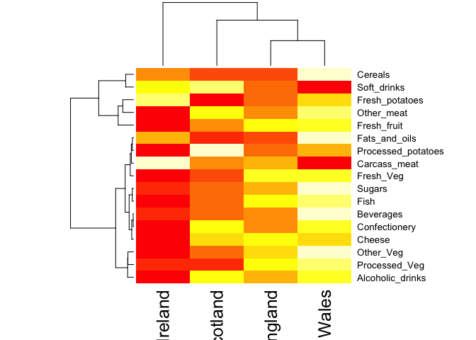
Note: Given that it is quite difficult to make sense of even this relatively small data set. Hopefully, we can clearly see that a powerful analytical method is absolutely necessary if we wish to observe trends and patterns in larger datasets.
PCA to the rescue
We need some way of making sense of the above data. Are there any trends present which are not obvious from glancing at the array of numbers?
Traditionally, we would use a series of pairwise plots (i.e. bivariate scatter plots) and analyse these to try and determine any relationships between variables, however the number of such plots required for such a task is clearly too large even for this small dataset. Therefore, for large data sets, this is not feasible or fun.
PCA generalizes this idea and allows us to perform such an analysis simultaneously, for many variables. In our example here, we have 17 dimensional data for 4 countries. We can thus ‘imagine’ plotting the 4 coordinates representing the 4 countries in 17 dimensional space. If there is any correlation between the observations (the countries), this will be observed in the 17 dimensional space by the correlated points being clustered close together, though of course since we cannot visualize such a space, we are not able to see such clustering directly (see the lecture slides for a clear description and example of this).
To perform PCA in R there are actually lots of functions to chose from and many packages offer slick PCA implementations and useful graphing approaches. However, here we will stick to the base R prcomp() function.
As we noted in the lecture portion of class, prcomp() expects the observations to be rows and the variables to be columns therefore we need to first transpose our data.frame matrix with the t() transpose function.
pca <- prcomp( t(x) )
summary(pca)
## Importance of components%s:
##                             PC1      PC2      PC3       PC4
## Standard deviation     324.1502 212.7478 73.87622 4.189e-14
## Proportion of Variance   0.6744   0.2905  0.03503 0.000e+00
## Cumulative Proportion    0.6744   0.9650  1.00000 1.000e+00
The first task of PCA is to identify a new set of principal axes through the data. This is achieved by finding the directions of maximal variance through the coordinates in the 17 dimensional space. This is equivalent to obtaining the (least-squares) line of best fit through the plotted data where it has the largest spread. We call this new axis the first principal component (or PC1) of the data. The second best axis PC2, the third best PC3 etc.
The summary print-out above indicates that PC1 accounts for more than 67% of the sample variance, PC2 29% and PC3 3%. Collectively PC1 and PC2 together capture 96% of the origional 17 dimensional variance. Thus these first two new principal axis (PC1 and PC2) represent useful ways to view and further investigate our data set. Lets start with a simple plot of PC1 vs PC2.
plot(pca$x[,1], pca$x[,2], xlab="PC1", ylab="PC2", xlim=c(-270,500))
text(pca$x[,1], pca$x[,2], colnames(x))
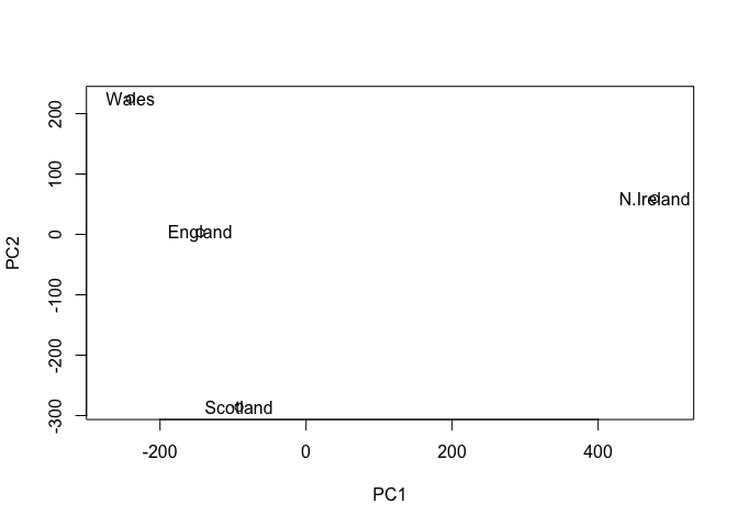
Once the principal components have been obtained, we can use them to map the relationship between variables (i.e. countries) in therms of these major PCs (i.e. new axis that maximally describe the original data variance).
In our food example here, the four 17 dimensional coordinates are projected down onto the two principal components to obtain the graph above.
As part of the PCA method, we automatically obtain information about the contributions of each principal component to the total variance of the coordinates. This is typically contained in the Eigenvectors returned from such calculations. In the prcomp() function we can use the summary() command above or examine the returned pca$sdev (see below).
In this case approximately 67% of the variance in the data is accounted for by the first principal component, and approximately 97% is accounted for in total by the first two principal components. In this case, we have therefore accounted for the vast majority of the variation in the data using only a two dimensional plot - a dramatic reduction in dimensionality from seventeen dimensions to two.
In practice, it is usually sufficient to include enough principal components so that somewhere in the region of 70% of the variation in the data is accounted for. Looking at the so-called scree plot can help in this regard. Ask Barry about this if you are unsure what we mean here.
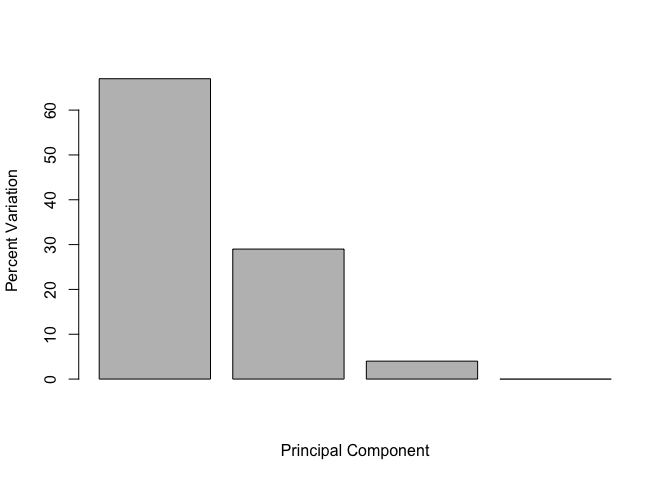
Below we can use the square of pca$sdev , which stands for “standard deviation”, to calculate how much variation in the original data each PC accounts for.
v <- round( pca$sdev^2/sum(pca$sdev^2) * 100 )
v
## [1] 67 29 4 0
## or the second row here...
z <- summary(pca)
z$importance
##                              PC1       PC2      PC3          PC4
## Standard deviation     324.15019 212.74780 73.87622 4.188568e-14
## Proportion of Variance   0.67444   0.29052  0.03503 0.000000e+00
## Cumulative Proportion    0.67444   0.96497  1.00000 1.000000e+00
This information can be summarized in a plot of the variances (eigenvalues) with respect to the principal component number (eigenvector number), which is given below.
barplot(v, xlab="Principal Component", ylab="Percent Variation")
Digging deeper
You can include R code in the document as follows:
cumsum(v)
## [1] 67 96 100 100
#
# biplot(pca)
#
# summary(pca)
#
# #biplot.prcomp
# #screeplot
#
# ## Add data for Rep.Ireland
# nd <- matrix(x[,4] + 3, nrow=1)
# colnames(nd) <- rownames(x)
# pred <- predict(pca, newdata=nd)```
We can also consider the influence of each of the original variables upon the principal components (typically known as loading scores). This information can be obtained from the prcomp() returned $rotation component. It can also be summarized with a call to biplot(), see below:
## Lets focus on PC1 as it accounts for > 90% of variance
par(mar=c(10, 4, 4, 2))
barplot( pca$rotation[,1], las=2 )
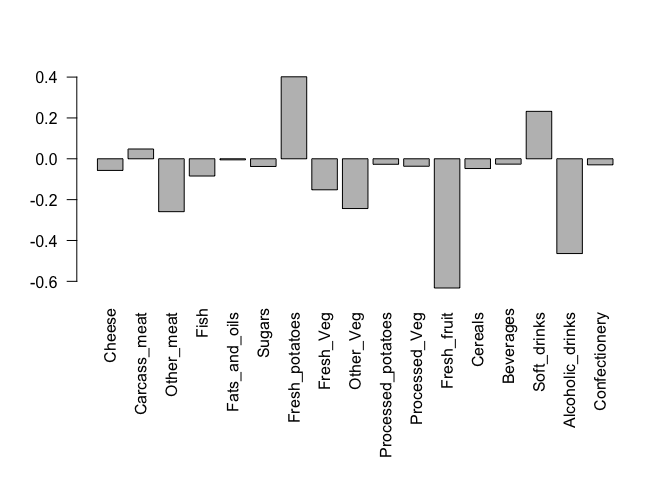
Here we see observations (foods) with the largest positive loading scores that effectively “push” N. Ireland to right positive side of the plot (including Fresh_potatoes and Soft_drinks).
We can also see the observations/foods with high negative scores that push the other countries to the left side of the plot (including Fresh_fruit and Alcoholic_drinks).
Another way to see this information together with the main PCA plot is in a so-called biplot:
## Or the inbuilt biplot() can be useful too
biplot(pca)
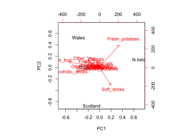
Observe here that there is a central group of foods (red arrows) around the middle of each principal component, with four on the periphery that do not seem to be part of the group. Recall the 2D score plot (Figure above), on which England, Wales and Scotland were clustered together, whilst Northern Ireland was the country that was away from the cluster. Perhaps there is some association to be made between the four variables that are away from the cluster in the main PCA plot and the country that is located away from the rest of the countries i.e. Northern Ireland. A look at the original data in Table 1 reveals that for the three variables, Fresh potatoes, Alcoholic drinks and Fresh fruit, there is a noticeable difference between the values for England, Wales and Scotland, which are roughly similar, and Northern Ireland, which is usually significantly higher or lower.
Note: PCA has the awesome ability to be able to make these associations for us. It has also successfully managed to reduce the dimensionality of our data set down from 17 to 2, allowing us to assert (using our figures above) that countries England, Wales and Scotland are ‘similar’ with Northern Ireland being different in some way. Furthermore, digging deeper into the loadings we were able to associate certain food types with each cluster of countries.
Section 2. PCA of example RNA-seq data
RNA-seq results often contain a PCA (Principal Component Analysis) or MDS plot. Usually we use these graphs to verify that the control samples cluster together. However, there’s a lot more going on, and if you are willing to dive in, you can extract a lot more information from these plots. The good news is that PCA only sounds complicated. Conceptually, as we have hopefully demonstrated here and in the lecture, it is readably accessible and understandable.
The example code below follows the main lecture example and generates fake RNA-seq count data on which to perform and interpret PCA results. In this example, the data is in a matrix called data.matrix where the columns are individual samples (i.e. cells) and rows are measurements taken for all the samples (i.e. genes).
## Just for the sake of the example, here's some made up data...
data.matrix <- matrix(nrow=100, ncol=10)

## Lets label the rows gene1, gene2 etc. to gene100
rownames(data.matrix) <- paste("gene", 1:100, sep="")

## Lets label the first 5 columns wt1, wt2, wt3, wt4 and wt5
##   and the last 5 ko1, ko2 etc. to ko5 (for "knock-out")
colnames(data.matrix) <- c(
  paste("wt", 1:5, sep=""),
  paste("ko", 1:5, sep=""))

head(data.matrix)
##       wt1 wt2 wt3 wt4 wt5 ko1 ko2 ko3 ko4 ko5
## gene1  NA  NA  NA  NA  NA  NA  NA  NA  NA  NA
## gene2  NA  NA  NA  NA  NA  NA  NA  NA  NA  NA
## gene3  NA  NA  NA  NA  NA  NA  NA  NA  NA  NA
## gene4  NA  NA  NA  NA  NA  NA  NA  NA  NA  NA
## gene5  NA  NA  NA  NA  NA  NA  NA  NA  NA  NA
## gene6  NA  NA  NA  NA  NA  NA  NA  NA  NA  NA
Now we fill in some fake read counts
for (i in 1:100) {
  wt.values <- rpois(5, lambda=sample(x=10:1000, size=1))
  ko.values <- rpois(5, lambda=sample(x=10:1000, size=1))

  data.matrix[i,] <- c(wt.values, ko.values)
}

head(data.matrix)
##       wt1 wt2 wt3 wt4 wt5 ko1 ko2 ko3 ko4 ko5
## gene1 295 281 254 293 267 316 310 308 290 302
## gene2 729 709 719 759 709 703 651 705 719 811
## gene3 523 513 467 525 537 819 778 821 813 835
## gene4  14  18  13  16  12 447 478 441 465 450
## gene5 568 556 548 553 521 875 887 872 936 915
## gene6 554 560 561 534 583 753 781 729 789 735
NOTE: The samples are columns, and the genes are rows!
Now lets do PCA and plot the results:
pca <- prcomp(t(data.matrix), scale=TRUE)

## simple plot of pc1 and pc2
plot(pca$x[,1], pca$x[,2])
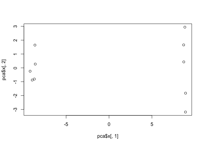
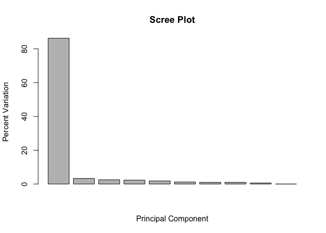
This quick plot looks interesting with a nice separation of samples into two groups of 5 samples each. Now we can use the square of pca$sdev, which stands for “standard deviation”, to calculate how much variation in the original data each PC accounts for
## Variance captured per PC
pca.var <- pca$sdev^2

## Precent variance is often more informative to look at
pca.var.per <- round(pca.var/sum(pca.var)*100, 1)
pca.var.per
## [1] 86.3 3.3 2.5 2.3 1.8 1.2 1.0 1.0 0.6 0.0
We can use this to generate our standard scree-plot like this
barplot(pca.var.per, main="Scree Plot",
        xlab="Principal Component", ylab="Percent Variation")
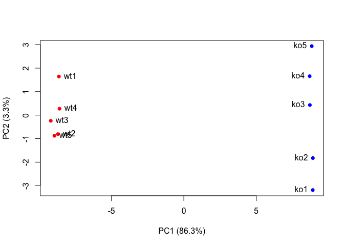
Now lets make our main PCA plot a bit more useful…
## A vector of colors for wt and ko samples
colvec <- colnames(data.matrix)
colvec[grep("wt", colvec)] <- "red"
colvec[grep("ko", colvec)] <- "blue"

plot(pca$x[,1], pca$x[,2], col=colvec, pch=16,
     xlab=paste0("PC1 (", pca.var.per[1], "%)"),
     ylab=paste0("PC2 (", pca.var.per[2], "%)"))

text(pca$x[,1], pca$x[,2], labels = colnames(data.matrix), pos=c(rep(4,5), rep(2,5)))
loading_scores <- pca$rotation[,1]

## Find the top 10 measurements (genes) that contribute
## most to pc1 in eiter direction (+ or -)
gene_scores <- abs(loading_scores)
gene_score_ranked <- sort(gene_scores, decreasing=TRUE)

## show the names of the top 10 genes
top_10_genes <- names(gene_score_ranked[1:10])
top_10_genes
##  [1] "gene31" "gene79" "gene83" "gene60" "gene4"  "gene40" "gene9"
##  [8] "gene14" "gene61" "gene62"
Section 3. PCA of protein structure data
Visit the Bio3D-web PCA app < http://bio3d.ucsd.edu > and explore how PCA of large protein structure sets can provide considerable insight into major features and trends with clear biological mechanisitc insight. Note that the final report generated from this app contains all the R code required to run the analysis yourself
Session Information
sessionInfo()
## R version 3.4.1 (2017-06-30)
## Platform: x86_64-apple-darwin15.6.0 (64-bit)
## Running under: macOS Sierra 10.12.6
##
## Matrix products: default
## BLAS: /Library/Frameworks/R.framework/Versions/3.4/Resources/lib/libRblas.0.dylib
## LAPACK: /Library/Frameworks/R.framework/Versions/3.4/Resources/lib/libRlapack.dylib
##
## locale:
## [1] en_US.UTF-8/en_US.UTF-8/en_US.UTF-8/C/en_US.UTF-8/en_US.UTF-8
##
## attached base packages:
## [1] stats     graphics  grDevices utils     datasets  methods   base
##
## loaded via a namespace (and not attached):
##  [1] compiler_3.4.1  backports_1.1.1 magrittr_1.5    rprojroot_1.2
##  [5] tools_3.4.1     htmltools_0.3.6 yaml_2.1.14     Rcpp_0.12.13
##  [9] stringi_1.1.6   rmarkdown_1.8   highr_0.6       knitr_1.17
## [13] stringr_1.2.0   digest_0.6.12   evaluate_0.10.1